Storybook
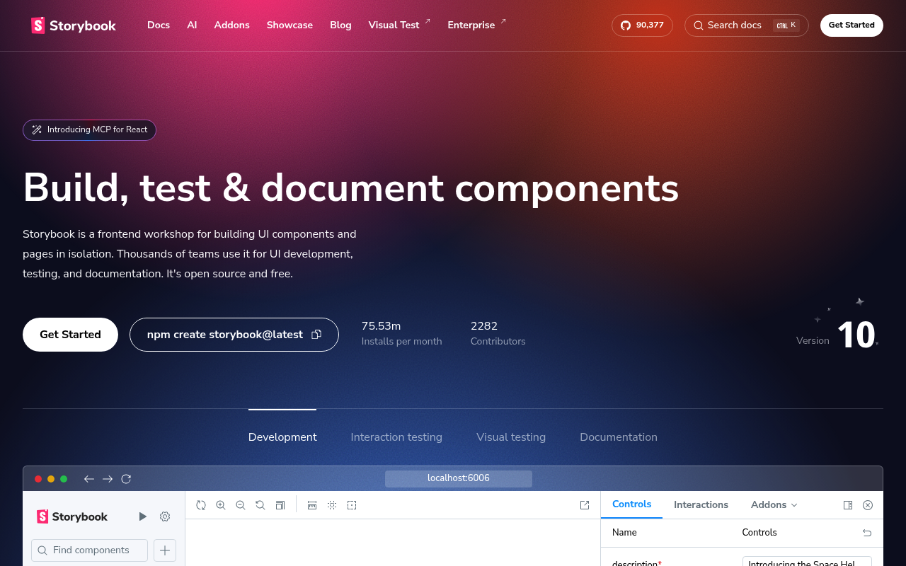
Storybook is the industry-standard frontend workshop for building, documenting, and testing UI components in isolation. It supports React, Vue, Angular, Svelte, Web Components, and a dozen other frameworks. Developers write stories capturing component states, use addons for interaction testing, accessibility auditing, visual testing, and design integration, and publish component documentation for design systems and component libraries. Storybook 10+ includes an MCP server enabling AI agents to understand components, generate stories, and run tests. The project is open source (MIT) and maintained by the storybookjs GitHub organization.
Storybook is listed with 2 APIs on the APIs.io network. Tagged areas include Accessibility Testing, Component Documentation, Component Testing, Design Systems, and Front-End Development.
The Storybook catalog on APIs.io includes 1 JSON-LD context and 1 Spectral governance ruleset.
Storybook’s developer surface includes documentation, engineering blog, release notes, YouTube channel, and 16 more developer resources.
Kin Score
 Kin Score
How this is scored →
Kin Score
How this is scored →scored 2026-10-23 · rubric v0.25.0
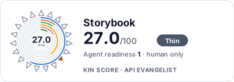 It updates itself when the score changes. Paste this where you link to your API docs:
<a href="https://apis.io/providers/storybook/"><img src="https://apis.io/badge/storybook/card.svg" alt="Storybook on APIs.io — Kin Score by API Evangelist"></a>Other styles, a README pill and a shields.io endpoint are on the badge page.
Markets this provider is in provisional
The Kin Score Market layer reads a provider inside its market: its position, and how deep its integrations go. Depth is only comparable within a position. Provisional and unweighted: not part of the Kin Score or agent readiness.
| Market | Position | Depth | Registered MCP server | Declares compatibility |
|---|---|---|---|---|
| Digital Accessibility (IAAP membership, W3C WAI evaluation tools) | undeclared | - | - | - |
Registered MCP server and declares compatibility are report only — not weighted. Undeclared means we found nothing we can read, so there is no number: we never infer integrations.
APIs 2
Individual APIs this provider publishes, each with its own machine-readable definition.
Storybook
Storybook is an open-source frontend workshop for building UI components and pages in isolation. Supports React, Vue, Angular, Svelte, Web Components, Ember, Preact, and more. C...
Storybook MCP Server
The Storybook MCP (Model Context Protocol) server enables AI agents to interact with a running Storybook instance. Available as the @storybook/addon-mcp addon (runs within the d...
Pricing Plans 1
Published pricing tiers and plan structures.
Rate Limits 1
Documented rate limits and quota policies.
Storybook Rate Limits
RATE LIMITSFinOps 1
Cost, billing, and metering signals for API financial operations.
Storybook Finops
FINOPSSemantic Vocabularies 1
JSON-LD contexts and semantic vocabularies used across these APIs.
Storybook Context
JSON-LDSpectral Rules 1
Spectral governance rulesets for linting and validating these APIs.
Storybook — jsonschema rules
SPECTRALJSON Schema 2
Standalone JSON Schema definitions for this provider's data models.
Storybook Story (CSF)
JSON SCHEMAJSON Structure 1
JSON Structure definitions describing this provider's data shapes.
Storybook Csf Structure
JSON STRUCTUREExamples 2
Example request and response payloads for these APIs.
Security Posture 1
Authentication, domain security, vulnerability disclosure, and trust-center signals.
Resources
Documentation 2
Reference material describing how the API behaves
Build 3
SDKs, sample code, and the tooling you integrate with
Access & Security 2
Authentication, authorization, and security posture
Learn 2
Tutorials, courses, talks, and written guidance
Operate 5
Status, limits, changes, and where to get help
Commercial 3
Pricing, plans, and the legal terms of use
Company 2
The organization behind the API
Other 1
Properties that don't map to a standard resource type
Source (apis.yml)
Work with this as data
Every provider here is available over the APIs.io API and to AI agents over MCP.